Tuesday, March 13, 2012

Command. Order. Imperatum.

© Hillary Rogers 2012
If you didn't already see my ridiculously happy post about finally getting my baby book, you should check it out. It encapsulates my joy really well. If it wasn't obvious from viewing that, I'm extremely happy with my book I got printed with Blurb. I was a little worried about all the blacks laying down really consistently and matching the shadows in my photos, but everything turned out really well. There were a few extremely minor imperfections (dust that got in the way of the printing process) but other than that the images were perfect and no pages got left out.
Overall, I feel that my images were able to achieve exactly what I was hoping to with this project. They captured the dichotomy of majesty and mischief that was present in so many people and ideals of antiquity. Especially as a book, it is really easy to see the careful interplay of the compositions and personalities that only strengthen my ideas and intentions. I'm really excited to finally show off the finished product (even if I've heavily contemplated making everyone wear white gloves).
Moving further with this project, I'll be taking these images and blowing them up to show in the Senior Exhibition coming up on May 25 of this year. I'm not sure how big I'll be going or really how I'll be hanging the images, but I'm surrounded by a great group of peers and professors that will help me figure out how to best display these works that I've dedicated so much time to perfected.

Thursday, March 1, 2012

THE BOOK IS HERE!

It's here! Let's see what it looks like...

The cover looks great! I just hope all my blacks match those in the book...

Should I open it? Yeah, why not!

Everything looks awesome! I got my blacks to match the colors of the background on the pages. Seeing these in print makes such a huge difference!

Thanks, Blurb! This makes me the happiest clam.

Tuesday, February 21, 2012

Finishing Up with Blurb

Alright, kiddos, the time has arrived! I've got all but one of my images color-corrected, I've added all the text except for the index that I'm finishing up for the back of the book, and I've decided on the visual rhythm of the pages. I'm really pleased with the two-page spreads I've included from my more figural series of photographs, since they add variety from the portrait busts that dominate the rest of the book.


Once I finish the index explaining the characteristics of the people in the book, I'll be ready to send it off to print at Blurb. Finally! After the book is done, I'll begin selecting photos to enlarge and print so I can include them in the Senior Exhibition in May!

Wednesday, February 15, 2012

Vanessa Beecroft: She Should Have Been a Cat Lady

Vanessa Beecroft or, as I like to call her, "that crazy lady that tried to essentially steal two Sudanese orphans because she's secretly fixated on Africa," was certainly an interesting artist to research. In terms of liking her, I'm sure you can look at the title of this post and my catchy nickname for her and get the impression that I don't really like her at all. And you'd be right. That doesn't make her art bad or offensive, but she's the type of artist that repels my personality.
VB45 by Vanessa Beecroft
While garnering attention for her semi-controversial installations, Beecroft's overall artistic stance and mental state have reached such a degree of dereliction that her art fails to be impactful. In the context of Relational Aesthetics, Beecroft attempts to turn art into a social institution by implying viewers into a normally awkward interstice between people at different stages and in different modes of dressing. By making the viewer feel out of place, she succeeds in making the audience uncomfortable but fails to leave a lasting impression due to her overarching obsession with fashionable female forms.
From Point to Artist by Vanessa Beecroft

Beecroft's work is not as controversial as she would have perhaps only the blind believe, but that does not make it unsuccessful in terms of Relational Aesthetics. I think she if she is a part of that movement, it's almost of utmost importance to make the splash she's trying to make, but all the same I interpret the movement as more nuanced than that. It is unsuccessful because the interactions and interstices should not have to be contrived in such a way that they are abundantly and instantly clear as Art with a capital A.

HillMarie's Photostream

Self Portrait #1Self Portrait #2Self Portrait #3Door #1Door #2Door #3
Gate of the GuggenheimDoor #4Going UpStairway to HeavenThe Form of the ForumSenatus Populusque Romanus
ColosseumIserniaAnam ShahidColin & HillaryMelody & AaronMelody
Meredith

Hey everyone! My Flickr gadget decided to kick the bucket, but if you're interested in any of my other photos that aren't in my Imperatum series, check out my Flickr Photostream!

Tuesday, February 14, 2012

Imperatum: Color Correction and Layouts

The printers are warming up and it's getting to be that time! I'll be sending my book in for printing within the next 2 weeks, so the crunch has begun to get all the details in place. After spending many continuous hours fiddling with color corrections and lighting adjustments, I feel that my photos are starting to reach a level of cohesion that will work really well within my book. Whether or not this is the final stage before making final prints, I'll have to see in the future.

Cover Photo © Hillary Rogers

Caligula © Hillary Rogers

After my one-on-one critique with our guest lecturer, Nick Olson, I feel that my photo series makes sense but could still do with some refinement. He suggested that I experiment a little further with my figural-focused works and push the saturation down even further within the portraitesque pieces. I feel that at this point I really need to decide what place the figure studies have within my body of work and within the book before I go ahead and sent the book in to print. In addition to all the color correction I've been able to complete, I've decided on text layouts and am in the process of adding an appendix that includes brief descriptions of the characters featured. At this moment, I'm getting a lot of satisfaction from the personalities I'm able to bring out through the portraits and will focus on those for the book. I'll still continue to shoot both portraits and strictly physical forms and decide in time which pieces will make it to my senior exhibition in May.

Nick Olson and the Role of Technology

The Water by Nick Olson from his Camp Tintype series
This past Monday I had the pleasure of hearing Nick Olson, a 2008 Lawrence University graduate, speak about his sojourn in tintype photography. I found it fascinating that there are still artists that can fully commit to a new lifestyle in order to immerse themselves in their art. Inspired by Thoreau's Walden, Olson has embarked on many endeavors, the most recent of which is entitled Mildred's Lane, that examine the way in which people interact with their environments both now and in the past.
Portrait 7 by Nick Olson

Koré by Hillary Rogers
Since I work so closely with (almost tethered to, if I'm honest) my computer for everything I do with my own photography, I was interested and surprised to find that there were certain parallels between Nick's goals and my own. He, too, searches for the beauty that is present in the simplicity of life in the past. My work focuses more on the similarities between past outrageous characters and present day celebrities, but to an extent I do strive to capture an essence of archaic forms of beauty in my aesthetic. Since Olson did a critical series of photographs focused on his contemporaries and how much time they spend at their computers, I'll be interested to see what he has to say about my process and products!

Tuesday, February 7, 2012

Imperatum

More time passes and more progress! I've changed the title of my digital photography collection and book from Personae to Imperatum. Imperatum translates to "command" and "order", which are the two main personality traits of the characters I'm capturing for my project. My book has made considerable progress especially in the way of adding new photos that I've been able to take this term. Other than the inclusion of text, I feel that the visual rhythm of the book is almost exactly where I want it to be for printing. I've been including older images with white backgrounds that I believe I'll be removing for the final print. Overall they disrupt the intimate feel that's achieved by using the close-cropping and black background that are present in my newer photos. I'll post a thumbnail of my page layout and some of my new images. I'll be enlarging some prints for my senior show, but am unsure about which to choose for printing and framing. I foresee much color-correction in my future and look forward to making the adjustments that have been suggested to me so far.
Current page layout for my book, Imperatum © Hillary Rogers
©Hillary Rogers Pericles

© Hillary Rogers Julia

© Hillary Rogers Cleopatra

Tuesday, January 24, 2012

Books, Blurb, and Bourriaud

Progress, Brothers! Ok, so we're not on the Potemkin, but progress is still happening. I've started to do page layouts for my book by Blurb and I'm really pleased with the visual rhythm of the book so far. My photos have a combination of black and white backgrounds, so I'm trying to use background colors as a way to prepare the viewer's palette so to speak. I'm going to take my older photos (photos with the white background) and edit them in Adobe Lightroom to create more aesthetic continuity among the photos in the book. I'll start by experimenting with one and see where that leads me. I'm thinking the book will end up being over sixty pages once I add attribution pages, and index, and my other photos. My models are all lined up to be photographed this week and next, so I'm hoping to capture some more gorgeous images both for large prints and to bring into the book.

©Hillary Rogers
I also did some reading about other photographers and their bookmaking endeavors as well as the influence of conceptual art on photography. Photography After Conceptual Art, edited by Diarmuid Costello and Margaret Iversen, explains how the shift of art's overall focus has affected the photographer and they way they present and document their works. Much of what resonated with me had to do with the way photographers dealt with text that accompanied their works as well as the artist's consideration of context. Ed Ruscha, even though much of his work revolves around capturing the truth of everyday life, has a similar approach to mine when it comes to the book as an object. He considers greatly the experience of the viewer looking through a book and how that is different and should be treated differently than viewing the art on its own and out of context. George Brecht's consideration of context was more focused on making his books appear interactive and echo reality through his use of text and graphic design. Overall, the combination of all these influences gave me an impression of documentation and context that was very similar to the need for art historians to contextualize pieces. This may have convinced me to include quotes from my Classics professor regarding the individuals that I end up using in my book.

Wednesday, January 18, 2012

Personae

©Hillary Rogers
As a former art history major focused on Roman art and avid Classics student, you could say that I'm a little obsessed with any and all things ancient. I've had the great fortune of having a number of professors that have introduced me not only to the art of antiquity, but also to the larger-than-life personalities of the past. My photo series, entitled Personae, will focus on trying to visually document the characters of the ancient world using my friends and my lens (pardon the rhyme).


Personae will exist as a series of large inkjet prints in an exhibition for my Senior Exhibition art show in May and will also be translated into book format by early March. This means there will be much photographing, editing, and test printing in my future, but it will lead to a quality end product. So far I have two gorgeous images and have made a list of other individuals I'd like to try and capture as well as the models I want to use for each of them.

Tuesday, January 17, 2012

Book Design

In addition to making large prints of my photographs this term, I want to make a book. But where to start? Well, I popped over to the library to find some inspiration. While I thought I would pick from mountains of gorgeous design books or piles of contemporary books about art, I actually chose a retrospective book as well as a book about public monuments.
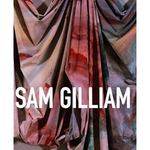
Jonathan P. Binstock's Sam Gilliam: a retrospective
The first book I found was a retrospective put together by Jonathan P. Binstock. The bleed on the cover is beautiful and richly colored. Also, I love the flush spine and the matte finish to the exterior of the book. When you open it, the book reads very much like any art history text book, but I must say that I love the treatment of the images. It seems very appropriate that, in a retrospective book, each piece floats in its own white space rather than doing bleeds of the images. Bleeds always suggest to me a certain contemporaneousness of the work. The images are slightly glossy, but definitely not matte finish. Overall, the design is clean, simple, and easily scanned by readers looking for a specific work.

The second book I found, Monuments for the USA,  was produced by the CCA Wattis Institute for Contemporary Arts. It is a catalogue of suggestions for monuments and public sculpture throughout the United States. I also really liked the matte cover of this book, even though the work within is of questionable quality at best. The way images inside the book are presented made me want to read through the entire book. There was a sense of randomness since there were so many different formats going on, but there was a rhythm that persisted through that madness.

Both of these books are at a scale that I'd want to print my work at, so I'll be interested to see which format influences my decisions more.

Saturday, January 14, 2012

Parody and Hysteria

Still from Cathy Cook's Immortal Cupboard:In Search of Lorine Neidecker (2009)

This week the video and filmmaker Cathy Cook took time to visit our class while she is on sabbatical from UMBC's visual arts program. Cook's lecture included a great number of cinematographic terms with visual aids that were provided by Cathy through her work and the work of one of her students, Samya Amorim. Cook's piece, June Brides, prominently featured her two most lasting inspirations: women and nature. What I found most striking, however, was the use of sound and color. My experience with the piece left me pondering what the hysteria of weddings would do to life if we had to encounter it on a daily basis. Of course, there would be the initial emotional high, but then the let down would come with the end of the festivities. Cathy's use of disorienting camera work and dissonant music and sound effects, she created a darkly funny look into how women in our society are expected to behave. Her work really reminded me of Terry Gilliam's animations from Monty Python's Flying Circus.
 
While I rarely, if ever, work with video, I could still relate to what inspired Cook the most: namely women and nature. Her documenting of extreme personalities and egos of brides directly relates to my work that I'm producing this term. After focusing on formal qualities, my next step in my series of photos is to try and capture in photos the personae of individuals immortalized in stone.
© Hillary Rogers