Wednesday, January 18, 2012

Personae

©Hillary Rogers
As a former art history major focused on Roman art and avid Classics student, you could say that I'm a little obsessed with any and all things ancient. I've had the great fortune of having a number of professors that have introduced me not only to the art of antiquity, but also to the larger-than-life personalities of the past. My photo series, entitled Personae, will focus on trying to visually document the characters of the ancient world using my friends and my lens (pardon the rhyme).


Personae will exist as a series of large inkjet prints in an exhibition for my Senior Exhibition art show in May and will also be translated into book format by early March. This means there will be much photographing, editing, and test printing in my future, but it will lead to a quality end product. So far I have two gorgeous images and have made a list of other individuals I'd like to try and capture as well as the models I want to use for each of them.

Tuesday, January 17, 2012

Book Design

In addition to making large prints of my photographs this term, I want to make a book. But where to start? Well, I popped over to the library to find some inspiration. While I thought I would pick from mountains of gorgeous design books or piles of contemporary books about art, I actually chose a retrospective book as well as a book about public monuments.
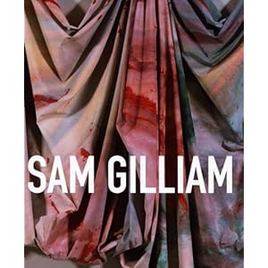
Jonathan P. Binstock's Sam Gilliam: a retrospective
The first book I found was a retrospective put together by Jonathan P. Binstock. The bleed on the cover is beautiful and richly colored. Also, I love the flush spine and the matte finish to the exterior of the book. When you open it, the book reads very much like any art history text book, but I must say that I love the treatment of the images. It seems very appropriate that, in a retrospective book, each piece floats in its own white space rather than doing bleeds of the images. Bleeds always suggest to me a certain contemporaneousness of the work. The images are slightly glossy, but definitely not matte finish. Overall, the design is clean, simple, and easily scanned by readers looking for a specific work.

The second book I found, Monuments for the USA,  was produced by the CCA Wattis Institute for Contemporary Arts. It is a catalogue of suggestions for monuments and public sculpture throughout the United States. I also really liked the matte cover of this book, even though the work within is of questionable quality at best. The way images inside the book are presented made me want to read through the entire book. There was a sense of randomness since there were so many different formats going on, but there was a rhythm that persisted through that madness.

Both of these books are at a scale that I'd want to print my work at, so I'll be interested to see which format influences my decisions more.

Saturday, January 14, 2012

Parody and Hysteria

Still from Cathy Cook's Immortal Cupboard:In Search of Lorine Neidecker (2009)

This week the video and filmmaker Cathy Cook took time to visit our class while she is on sabbatical from UMBC's visual arts program. Cook's lecture included a great number of cinematographic terms with visual aids that were provided by Cathy through her work and the work of one of her students, Samya Amorim. Cook's piece, June Brides, prominently featured her two most lasting inspirations: women and nature. What I found most striking, however, was the use of sound and color. My experience with the piece left me pondering what the hysteria of weddings would do to life if we had to encounter it on a daily basis. Of course, there would be the initial emotional high, but then the let down would come with the end of the festivities. Cathy's use of disorienting camera work and dissonant music and sound effects, she created a darkly funny look into how women in our society are expected to behave. Her work really reminded me of Terry Gilliam's animations from Monty Python's Flying Circus.
 
While I rarely, if ever, work with video, I could still relate to what inspired Cook the most: namely women and nature. Her documenting of extreme personalities and egos of brides directly relates to my work that I'm producing this term. After focusing on formal qualities, my next step in my series of photos is to try and capture in photos the personae of individuals immortalized in stone.
© Hillary Rogers


Saturday, January 7, 2012

Deb Brehmer and the White Cube

Deb Brehmer at Art Chicago
This week Lawrence University was lucky enough to host Deb Brehmer, the Director of the Portrait Society Gallery in Milwaukee. While I wasn't able to attend her lecture about the most recent exhibition gracing the walls of her gallery, I was able to have a deeply satisfying discussion about the successes and failures of the modern art gallery. Brehmer's gallery is currently comprised of a number of smaller rooms. This offers an intimate experience for viewers and also it creates an encounter with art that differs from the norm presented by other galleries. Brehmer has the opportunity to expand into a new and very malleable space and discussed with myself and other Senior Seminar members what she should do to appeal to art audiences while still breaking with the idea of the White Cube as a gallery template. Among the ideas thrown out by myself and other students were ideas of interactivity and food or drink to make the gallery experience a more social affair. I'm looking forward to seeing the space once Deb is able to construct her new space.

© Hillary Rogers
I was also able to do a one-on-one critique with Deb. I showed her a number of prints that I did last term for an independent study course. My photos focused on the formal aspects of the human figure that evoke the great works and personalities of antiquity. I had a difficult time figuring out what the viewer was supposed to get from the experience, but I found Brehmer's remarks extremely helpful. She enjoyed my combination of classical and contemporary, but had some words of wisdom to help me to further develop the concept of my work. As an art history professor and gallery director she was able to advise me to discover why I am as fascinated as I am with the subjects I choose to photograph. As I continue this photo series, I plan to step away from the figure study approach I had been taking and focus on the historical personalities that I am so drawn to and feel the need to document.

Saturday, March 12, 2011

Books by Blurb

Well, I finally got my book from Blurb, and I must say I'm a bit disappointed. Their print quality was fine and I got my book in time to present it, however they left 2 entire pages out! Also, they let me know AFTER I had uploaded my PDFs that there were further formatting issues. Overall, not a very efficient site. They'll be hearing from me soon and perhaps I can corrected re-print.
As far as my project is concerned, I'm pleased with the way it turned out. My models were fantastic and, thanks to all those who I mentioned in my previous post, all the lighting and cropping details turned out flawlessly.

As much fun as this project was, I don't see myself continuing it any time soon. The next subject I'd be interested in looking into would be the idea of self image and a more up-to-date examination of how our society places value on perfection. At the moment, I think that will result in a portfolio of self-portraits, but we'll see what inspiration some (fingers crossed!) warmer weather brings. Congratulations to all my classmates on projects well done!

Friday, March 4, 2011

Poetry in Motion

As you know by now, I have sent in my book to have it printed. I'm hoping that paying for expedited shipping has done the trick, but I guess I shall soon find out. Also, to anyone looking to publish, Blurb is a fantastic site to work with. They have step-by-step instructions, templates for every book size, as well as a built-in pre-print file check. A very streamlined operation, so definitely check it out. Also, on the topic of the project, my instructors Julie and Johnny have instructed us to craft, instead of an artist's statement, a haiku that summarizes our project. I am no poet, but here's my attempt:

Peek at glory past.
If only marble mouths could
move, what would they say?

While I was wrapping up this project, I decided to see if what I was doing was original or not. This also gave me the opportunity to draw inspiration from other artists. I ended up finding the photographer Eugenio Recuenco. Biographical information was in short supply, but the professional work done by this Spanish artist is extensive to say the least. He's done high fashion shoots for every major event, magazine, and designer. Don't believe me? Check out the client section of his website.
The obvious difference between Recuenco and myself is that he chooses to depict well-known fairy tales in some of his work. He also chooses a discreet moment of the narrative that is easily identifiable. With recreating statues and portraiture, I didn't really have the need to contextualize the works, as they are already out of context by being in a gallery rather than our mind's eye. Overall, I found Recuenco's work very inspiring, but it didn't lead to any significant artistic breakthroughs for myself. I also found it a little odd that the only work he considered "fine art" was his Untitled. It's interesting that a person with such success would classify their work that way.
In regards to the Kristin Boehm lecture, I was a little underwhelmed. Perhaps it was in the way that she presented, but it didn't sound to me like she had been attempting to network with other artists until well after she had graduated. Having an internship at a summer camp is not something that I would look forward to and not have a post-camp plan. I feel as though Kristin really missed an opportunity to emphasize the importance of networking well before we are faced with the real world.

Thursday, February 24, 2011

I Don't Get It: Portraiture and Propaganda

Clare Bohrer as a peplos kore.

As my winter term at Lawrence University draws to a close, the final touches are being put on my term project I Don't Get It: Portraiture and Propaganda. This work, which is based on my previous series of photos by the same name, expands the notion of the meaningless nature of decontextualized propaganda. In this 40 page book, I put my favorite 9 portraits on display accompanied by the originals from antiquity. Thus far, I have 8 of the 9 photos taken. Due to one of my models being ill, we had to postpone the shoot multiple times. However, that should be happening within the next two days. Otherwise, I'm completely done formatting book and it's all set to be sent off to Blurb for publishing soon. Also, a quick thank you to Julie and Johnny as well as Ali Scattergood for all their help and guidance with photography.

Just as a teaser, here are a couple of my favorite works from the book. Can't wait to see the final product!

Allison Bjork as an aristocratic Flavian woman.

Collin McCanna as the Apoxymenos.